ribs.visualize.parallel_axes_plot
-
ribs.visualize.parallel_axes_plot(archive: CVTArchive | GridArchive | SlidingBoundariesArchive | ProximityArchive, ax: Axes | None =
None, *, df: DataFrame | ArchiveDataFrame | None =None, measure_order: Sequence[int] | Sequence[tuple[int, str]] | None =None, cmap: str | Sequence[matplotlib.typing.ColorType] | Colormap ='magma', linewidth: float =1.5, alpha: float =0.8, vmin: float | None =None, vmax: float | None =None, sort_archive: bool =False, cbar: 'auto' | None | Axes ='auto', cbar_kwargs: dict | None =None) None[source]¶ Visualizes archive elites in measure space with a parallel axes plot.
This visualization is meant to show the coverage of the measure space at a glance. Each axis represents one measure dimension, and each line in the diagram represents one elite in the archive. Three main things are evident from this plot:
measure space coverage, as determined by the amount of the axis that has lines passing through it. If the lines are passing through all parts of the axis, then there is likely good coverage for that measure.
Correlation between neighboring measures. In the below example, we see perfect correlation between
measures_0andmeasures_1, since none of the lines cross each other. We also see the perfect negative correlation betweenmeasures_3andmeasures_4, indicated by the crossing of all lines at a single point.Whether certain values of the measure dimensions affect the objective value strongly. In the below example, we see
measures_2has many elites with high objective near zero. This is more visible whensort_archiveis passed in, as elites with higher objective values will be plotted on top of individuals with lower objective values.
Examples
import numpy as np
import matplotlib.pyplot as plt
from ribs.archives import GridArchive
from ribs.visualize import parallel_axes_plot

# Populate the archive with the negative sphere function.
archive = GridArchive(
              solution_dim=3, dims=[20, 20, 20, 20, 20],
              ranges=[(-1, 1), (-1, 1), (-1, 1),
                      (-1, 1), (-1, 1)],
          )
for x in np.linspace(-1, 1, 10):
    for y in np.linspace(0, 1, 10):
        for z in np.linspace(-1, 1, 10):
            archive.add_single(
                solution=np.array([x,y,z]),
                objective=-(x**2 + y**2 + z**2),
                measures=np.array([0.5*x,x,y,z,-0.5*z]),
            )

# Plot a heatmap of the archive.
plt.figure(figsize=(8, 6))
parallel_axes_plot(archive)
plt.title("Negative sphere function")
plt.ylabel("axis values")
plt.show()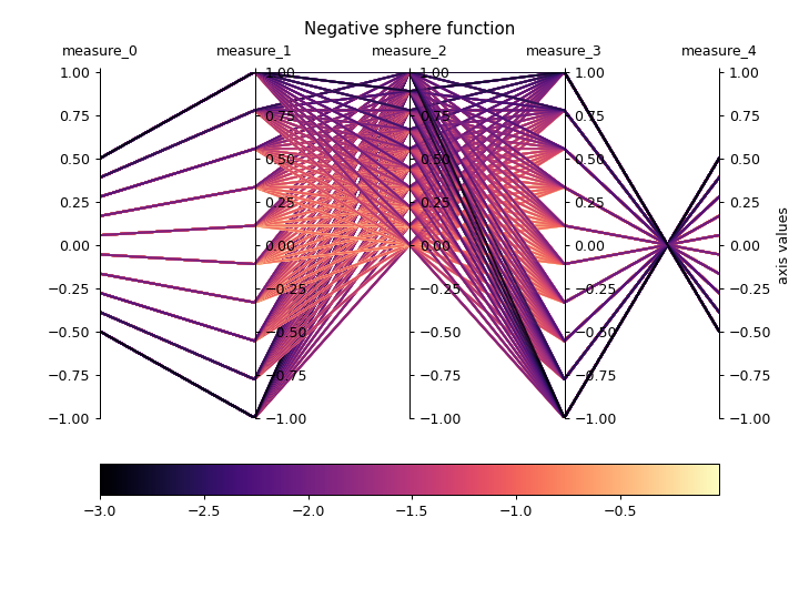
- Parameters:
- archive: CVTArchive | GridArchive | SlidingBoundariesArchive | ProximityArchive
Pyribs archive. If the archive has the
lower_boundsandupper_boundsproperties, those will be used as the measure space bounds for the plot. Otherwise, we will calldata()and retrieve the min/max measure values in the archive to determine the bounds – this call may fail if the archive has nodatamethod.- ax: Axes | None =
None¶ Axes on which to create the plot. If
None, the current axis will be used.- df: DataFrame | ArchiveDataFrame | None =
None¶ If provided, we will plot data from this argument instead of the data currently in the archive. This data can be obtained by, for instance, calling
data()withreturn_type="pandas"and modifying the resultingArchiveDataFrame. Note that, at a minimum, the data must contain columns for index, objective, and measures. To display a custom metric, replace the “objective” column.- measure_order: Sequence[int] | Sequence[tuple[int, str]] | None =
None¶ If this is a list of ints, it specifies the axes order for measures (e.g.
[2, 0, 1]). If this is a list of tuples, each tuple takes the form(int, str)where the int specifies the measure index and the str specifies a name for the measure (e.g.[(1, "y-value"), (2, "z-value"), (0, "x-value")]). The order specified does not need to have the same number of elements as the number of measures in the archive, e.g.[1, 3]or[1, 2, 3, 2].- cmap: str | Sequence[matplotlib.typing.ColorType] | Colormap =
'magma'¶ The colormap to use when plotting intensity. Either the name of a
Colormap, a list of Matplotlib color specifications (e.g., an \(N \times 3\) or \(N \times 4\) array – seeListedColormap), or aColormapobject.- linewidth: float =
1.5¶ Line width for each elite in the plot.
- alpha: float =
0.8¶ Opacity of the line for each elite (passing a low value here may be helpful if there are many archive elites, as more elites would be visible).
- vmin: float | None =
None¶ Minimum objective value to use in the plot. If
None, the minimum objective value in the archive is used.- vmax: float | None =
None¶ Maximum objective value to use in the plot. If
None, the maximum objective value in the archive is used.- sort_archive: bool =
False¶ If
True, sorts the archive so that the highest performing elites are plotted on top of lower performing elites.- cbar: 'auto' | None | Axes =
'auto'¶ By default, this is set to
'auto'which displays the colorbar on the archive’s currentAxes. IfNone, then colorbar is not displayed. If this is anAxes, displays the colorbar on the specified Axes.- cbar_kwargs: dict | None =
None¶ Additional kwargs to pass to
colorbar(). By default, we set “orientation” to “horizontal” and “pad” to 0.1.
- Raises:
ValueError – The measures provided do not exist in the archive.
TypeError –
measure_orderis not a list of all ints or all tuples.